Fig. 2.
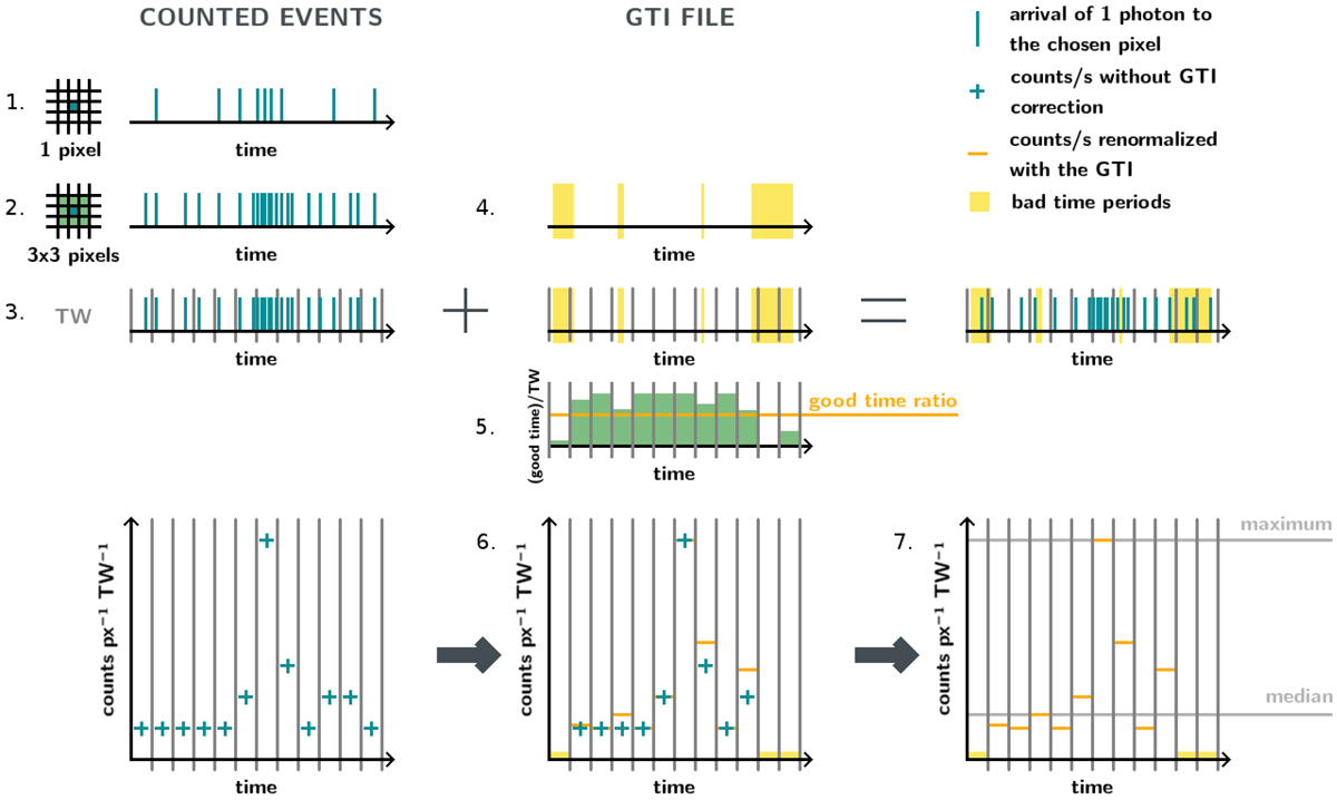
Diagram of the variability computation with the different stages of the algorithm. The vertical blue lines indicate the arrival time of the photons during the observation. The vertical gray lines represent the time bins. The blue crosses indicate the counts per time window per pixel without filtering for the GTI. The yellow shaded regions indicate the time periods contaminated by soft proton flares. The green rectangles show the good time over the duration of the time window for each time window. The orange horizontal lines show the counts per time window per pixel after renormalising with the GTI, and the yellow horizontal lines show the time windows that will not be taken into account because they are below the good time ratio. Finally, the gray horizontal lines indicate the maximum 𝒞max and the median ![]() counts that will be used to compute the variability.
counts that will be used to compute the variability.
Current usage metrics show cumulative count of Article Views (full-text article views including HTML views, PDF and ePub downloads, according to the available data) and Abstracts Views on Vision4Press platform.
Data correspond to usage on the plateform after 2015. The current usage metrics is available 48-96 hours after online publication and is updated daily on week days.
Initial download of the metrics may take a while.